Mito Clones
Using vireo for clonal reconstruction - mitochondrial mutations
Yuanhua @ 22/05/2024
This notebook is for the MKN45 dataset used in the MQuad paper (Figure 4). For earlier notebook on the Ludwig dataset, please see the notebook vireoSNP_clones.ipynb.
Generally, you can use cellSNP-lite to genotype mitochondrial genomes and call clonal informed mtDNA variants with MQuad.
With the filtered variants at hand, we can use the vireoSNP.BinomMixtureVB class to reconstruct the clonality.
[1]:
import vireoSNP
import numpy as np
from scipy import sparse
from scipy.io import mmread
import matplotlib.pyplot as plt

print(vireoSNP.__version__)
0.5.8
[2]:
# np.set_printoptions(formatter={'float': lambda x: format(x, '.5f')})
[3]:
import requests
from io import BytesIO

data_path = "https://github.com/aaronkwc/MQuad_paper_reproduced_results/raw/main/mkn45/data/mquad/"

AD = mmread(BytesIO(requests.get(data_path + "passed_ad.mtx").content)).tocsc()
DP = mmread(BytesIO(requests.get(data_path + "passed_dp.mtx").content)).tocsc()

mtSNP_ids = np.genfromtxt(data_path + "passed_variant_names.txt", dtype='str')

# AD = mmread("data/passed_ad.mtx").tocsc()
# DP = mmread("data/passed_dp.mtx").tocsc()
# mtSNP_ids = np.array(['mt_variant%d' %x for x in range(AD.shape[0])])
Identify clones
[4]:
from vireoSNP import BinomMixtureVB
[5]:
_model = BinomMixtureVB(n_var=AD.shape[0], n_cell=AD.shape[1], n_donor=5)
_model.fit(AD, DP, min_iter=30, n_init=50)
print(_model.ELBO_iters[-1])
Warning: VB did not converge!

Warning: VB did not converge!

-187279.56724807795
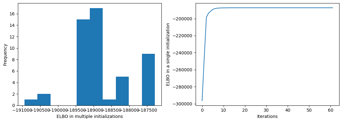
Check the model fitting
[6]:
fig = plt.figure(figsize=(11, 4))
plt.subplot(1, 2, 1)
plt.hist(_model.ELBO_inits)
plt.ylabel("Frequency")
plt.xlabel("ELBO in multiple initializations")

plt.subplot(1, 2, 2)
plt.plot(_model.ELBO_iters)
plt.xlabel("Iterations")
plt.ylabel("ELBO in a single initialization")

plt.tight_layout()
plt.show()
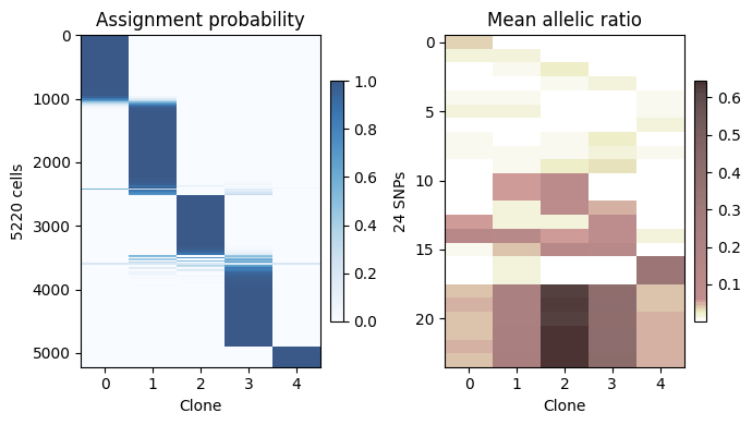
Visualize assignment probability and allele frequency
[7]:
# In mitochondrial, allele frequency is highly informative between 0.01 to 0.1,
# so we rescale the colour to give more spectrum for this region.
# You can design/choose your own colors from here:
# https://matplotlib.org/stable/tutorials/colors/colormaps.html

from matplotlib import cm
from matplotlib.colors import ListedColormap, LinearSegmentedColormap

raw_col = cm.get_cmap('pink_r', 200)
new_col = np.vstack((raw_col(np.linspace(0, 0.7, 10)),
                     raw_col(np.linspace(0.7, 1, 90))))
segpink = ListedColormap(new_col, name='segpink')
/tmp/ipykernel_1193464/1441482904.py:9: MatplotlibDeprecationWarning: The get_cmap function was deprecated in Matplotlib 3.7 and will be removed two minor releases later. Use ``matplotlib.colormaps[name]`` or ``matplotlib.colormaps.get_cmap(obj)`` instead.
  raw_col = cm.get_cmap('pink_r', 200)
[8]:
from vireoSNP.plot import heat_matrix

fig = plt.figure(figsize=(7, 4), dpi=100)
plt.subplot(1, 2, 1)
im = heat_matrix(_model.ID_prob, cmap="Blues", alpha=0.8,
                 display_value=False, row_sort=True)
plt.colorbar(im, fraction=0.046, pad=0.04)
plt.title("Assignment probability")
plt.xlabel("Clone")
plt.ylabel("%d cells" %(_model.n_cell))
plt.xticks(range(_model.n_donor))


plt.subplot(1, 2, 2)
im = heat_matrix(_model.beta_mu, cmap=segpink, alpha=0.8,
                 display_value=False, row_sort=True)
plt.colorbar(im, fraction=0.046, pad=0.04)
plt.title("Mean allelic ratio")
plt.xlabel("Clone")
plt.ylabel("%d SNPs" %(_model.n_var))
plt.xticks(range(_model.n_donor))

plt.tight_layout()
plt.show()
# plt.savefig("you_favorate_path with png or pdf")
Diagnosis
We are using multiple initializations via n_init and choose the one with highest ELBO. However, this doesn’t guarantee to be the global optima. To double check it, we can run the same scripts multiple time (without fixed random seed), and check if the same (best) ELBO is found.
If yes, it is likely to be the global optima, otherwise, we need increase n_init, e.g., 300 for more search.
[9]:
n_init = 50
for i in range(3):
    _model = BinomMixtureVB(n_var=AD.shape[0], n_cell=AD.shape[1], n_donor=3)
    _model.fit(AD, DP, min_iter=30, n_init=n_init)
    print("rerun %d:" %i, _model.ELBO_iters[-1])
rerun 0: -204505.03278377652
rerun 1: -204505.03278377396
rerun 2: -204505.03278377466
[ ]:
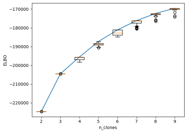
It is generally difficult to identify the number of clones, which is a balance between subclone resolution and analysis reliability. More clones may be preferred, but there could be a higher risk that the subclones are not genuine but rather technical noise.
Here, we could use ELBO for different numbers of clones as an indicator for model selection. However, this is still imperfect. One empirical suggestion is to choose the n_clones when ELBO stops increasing dramatically, for example, in the case below, we will pick 3 clones or 5 clones.
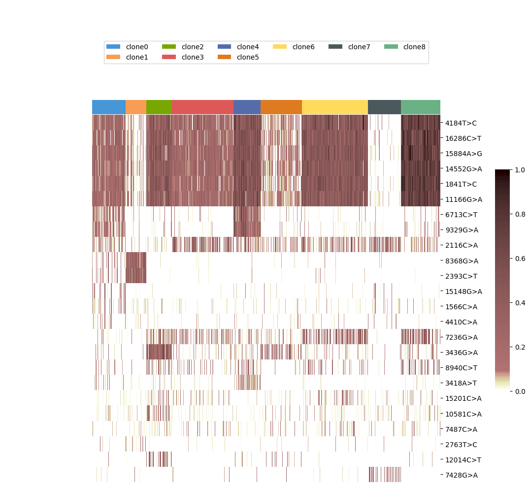
For visually inspecting, I would suggest making the number of clones larger (e.g., 9) and then considering merging some clones.
[10]:
n_init = 50
n_clone_list = np.arange(2, 10)

_ELBO_mat = []
for k in n_clone_list:
    _model = BinomMixtureVB(n_var=AD.shape[0], n_cell=AD.shape[1], n_donor=k)
    _model.fit(AD, DP, min_iter=30, n_init=n_init)
    _ELBO_mat.append(_model.ELBO_inits)
Warning: VB did not converge!

Warning: VB did not converge!

Warning: VB did not converge!

Warning: VB did not converge!

Warning: VB did not converge!

Warning: VB did not converge!

Warning: VB did not converge!

Warning: VB did not converge!

Warning: VB did not converge!

Warning: VB did not converge!

Warning: VB did not converge!

Warning: VB did not converge!

Warning: VB did not converge!

Warning: VB did not converge!

Warning: VB did not converge!

Warning: VB did not converge!

Warning: VB did not converge!

Warning: VB did not converge!

Warning: VB did not converge!

Warning: VB did not converge!

Warning: VB did not converge!

Warning: VB did not converge!

Warning: VB did not converge!

Warning: VB did not converge!

Warning: VB did not converge!

Warning: VB did not converge!

Warning: VB did not converge!
[11]:
plt.plot(np.arange(1, len(n_clone_list)+1), np.max(_ELBO_mat, axis=1))
plt.boxplot(_ELBO_mat)
plt.xticks(np.arange(1, len(n_clone_list)+1), n_clone_list)
plt.ylabel("ELBO")
plt.xlabel("n_clones")
plt.show()
[ ]:
Visualization
If you want to visualise the raw allele frequency with annotation of cells, you may consider seaborn.clustermap. We also wrap this function here as vireoSNP.plot.anno_heat for quick use.
[12]:
# label clones

cell_label = np.array(['clone%d' %x for x in np.argmax(_model.ID_prob, axis=1)])
id_uniq = np.unique(cell_label)
[13]:
# sort variants

clone_ids = np.argmax(_model.ID_prob, axis=1)

AF_mat = AD.A/(DP.A + 0.0001)
var_idx = np.argsort(AF_mat @ (5**(max(clone_ids) - clone_ids)))[::-1]
[14]:
var_idx
[14]:
array([11,  4,  2,  1,  3,  0, 13,  7, 10,  8,  5, 15, 18, 23,  9,  6, 12,
       20, 16, 19, 21, 22, 14, 17])
[15]:
vireoSNP.plot.anno_heat((AD/DP)[var_idx, :], col_anno=cell_label, col_order_ids=id_uniq,
                        cmap=segpink, yticklabels=mtSNP_ids[var_idx])
[15]:
<seaborn.matrix.ClusterGrid at 0x7428b2c8ab90>
[ ]: